At the end of my previous post, “A
Cuban Adventure Totally Objective,” I said I would revisit the need to transform
subject facts into picture facts if
appreciating the art in painting is the goal.
Since then, I fell
into that blank space writers unhappily know all too well: I had no idea how to
approach this topic without repeating past posts. Its other name is writer’s block. So I wallowed in this misery until this
morning. Then, like a gift, as I ran in
the freezing air, I connected two disparate exhibits: a Matisse exhibit at the
Met I visited a few weekends ago and a new exhibit at the Met, “Impressionism,
Fashion and Modernity,” that opens February 26.
Roberta Smith summarized the new one, “Impressionism,” this way: “In fresh, groundbreaking
ways this show details the entwined rise of modern painting, modern fashion and
modern (upper middle-class) life over some two dozen years of rapid change in
Paris, 1862-1867.” (New York Times, 2/22/13,
pp. C1 and C21).
In November, Roberta
Smith summarized “Matisse: In Search of True Painting” this way: “As ravishing
as it is succinct, it skims across this French master’s long productive career
with a mere 49 paintings, but nearly all are stellar if not pivotal works…. The
textbook simplicity of this format is irresistible. The visual self-schooling
particular to looking at art kicks in, and almost before you know it your eyes
are off and running, darting back and forth, parsing differences in style,
brushwork, color, detail and overall effect, the expression of emotion that
Matisse said he was always after.” (New
York Times, 11/30/2012, p. C21 and C24.)
In other words, the
“Matisse” exhibit encouraged viewers to do the work of art (with work used as
a verb, since what we do is definitely labor intensive).
In the “Matisse”
exhibit, Matisse’s painting “The Large Blue Dress” hangs to the left of the skirt
Lydia Delectorskaya, his model, wore while posing. Rebecca Rabinow tells us, in
the catalog to the exhibit, Lydia made the dress herself: “a blue gown with
leg-of-mutton sleeves, embellished with white organza cuffs and ruffles along
the edges of the overskirt, neckline, and bodice.” (“The Woman in Blue,” Matisse: In Search of True Painting, 2012, The Metropolitan Museum
of Art, pp. 142-143.
.jpg) |
Matisse, The Large Blue Dress,1937, PMA
|
 |
Skirt sewn by Lydia Delectorskaya, and worn by her while posing for Matisse's The Large Blue Dress, ca. 1936. Silk with cotton lace trim. Private collection
|
If you go to the Met website and you listen
to a short video describing this painting, you will hear the curator, Rebecca
Rabinow, also describe the photographs a photographer Matisse named Matossian made
to document his progress. Rabinow says:
“The sequence of photographs show Matisse first presenting Lydia within the
interior of his studio. But as the painting evolved, it becomes less about him
trying to portray a specific person, as opposed to creating or conveying [the]
emotion that he has. These photographs show not studies for the painting, but
the actual evolution of the canvas. The skirt, the dress—it all changes
dimensions. Shadows climb up. The settee's arms become arabesque curves. He's
not in the least bit interested in a naturalistic representation of what he
sees. He used [the dress] … to express the emotion that he felt when he looked
at an object. He's trying to capture [its] essence.” (Click here to view the video and listen to
Rabinow’s description: Matisse.)
Let’s examine some key words she uses: “the
emotion that he felt,” and “trying to capture its essence.”
If I synthesize her language even more, the
key words become “feelings” and “essence.”
What do “feelings” mean in this context? And what is the “essence” of an object?
In Dr. Barnes and Violette de Mazia’s
vocabulary, feelings are the broad human qualities an artist perceives in an
object (feelings like power, drama, fluidity, delicacy), that become the “essence”
of the object as an artist transforms a subject into a picture idea.
It is as if the artist says, “I feel a
strong sense of solidity in this apple,” or “I feel such delicacy and fragility
in this landscape.” At this moment,
whatever the object was (apple, chair, hat, skirt, tree), it becomes a color
unit and is orchestrated into a color composition. The artist creates an entirely new object, a
picture. And embedded in the picture is
the meaning of the artist’s aesthetic experience.
My classroom students tell me they know this. They feel insulted when I remind them that a
color unit is not the same as what it represents. But when they look at a painting, they
continue to describe the colors on the flat surface as if they were trees, or
apples, or figures.
Let’s look at this another way. In one of the last essays Violette de Mazia
wrote, she examined the use of headdresses in painting. She described “hats” used by Cézanne, Renoir,
and Matisse, not the same hats, but the use of “hats” as they functioned in each
picture—in the broad human values expressed as revealed by
the qualities each “hat” embodied.
Here is each painting:
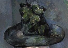
 |
Cézanne, Madame Cézanne with Green Hat,1891–1892, Barnes
|
 |
| Renoir, The Artist's Family, 1896, Barnes |
 |
| Matisse, Seated Riffian, 1912, Barnes |
De Mazia says: (1)
In the case of the Cézanne, the hat, a platform topped by a rising column, is
as if made of stone or metal—hard, solid, weighty, frozen—and provides, at the
top of the picture area, a counterbalance to the lap and hands at the picture’s
lower portion, at the same time equilibrating the thrust and counter-thrust of
the architectural components of the figure:
(2) The hat of the
standing woman in the Renoir, made of lush colors, as of a garden of flowers,
is a voluptuous volume that is echoed in the small tree at the side, in the
houses, in the woman’s blouse and skirt, in the child’s bonnet; it is, in
addition, one of a group of hats that includes the hat on the boy and the hat
on the girl, all three of which, by their relationships to each other,
emphasize the closed-in effect of the composition and the contrast of axial
planes created by the presentation of the figures:

(3) In the
Matisse, the headdress is essentially a set of more or less parallel,
curvilinear, contrasting bands of color that are in keeping with and complete
the theme of bands and stripes in the rest of the painting. (“The Form of
Seurat’s ‘The Models,’” Vistas, Vol.
V, No. 1, 1990, pp. 9-10)

De Mazia’s point:
the transformation of “hat” into color unit fits the purpose and the context of
the picture. It is not the artist’s job
to record the kind of hat the figure wore, but “to record the aesthetic
character it acquired from the artist’s imaginative perception of a situation
in which the hat plays a part and to record it in terms of broad human values.”
In Cézanne’s
picture, power and architectural equilibrium are expressed, and the color unit
that says “hat” fits that purpose; in Renoir’s picture, fluidity, warmth, and
richness are expressed, and the units that say “hats” fit that purpose; in the
Matisse, the contrast of exotic color drama comes about by pattern of shapes,
and the “hat” fits that purpose.
Now examine the
Matisse painting that started this exploration: The Large Blue Dress.
Here it is upside
down:

Matisse
transformed Lydia Delectorskaya wearing her blue dress into a series of symmetrical
arabesques, flattened bright color units, set in a subtle space recession. He uses single flat colors evenly filling a
pattern of clean-cut areas—an idea that eventually leads him to paper
cut-outs.
For the artist,
the conversion of subject to picture idea occurs in magic moments that change
everything. While Matossian’s
photographs reveal some of the revisions Matisse made to this picture over a
period of time, they do not account for the why. The picture holds the answer, and we discover
it by uncovering the art in it.
Notice the
following pictures facts when I slice the picture in half. First, the left side:
.jpg)
1.
The
background black grid sets off the “swan’s neck” yellow arabesque, followed by
the red arc with its pink linear pattern, and the blue-gray curve of the
“skirt,” all units sliding one behind the other.
2.
The white
“skirt’s trim” rhythmically echoes the yellow arabesque.
3.
The
internal pink linear pattern in the red arc is rhythmically echoed in the gray
rectangle above and to the right of the black grid’s top arc.
4.
The
curvilinear pattern of the “skirt’s trim” is echoed in the smaller yellow
rectangle to the left of the gray one.
5.
The red
background repeats the grid of the black arc, but with larger rectangles.
6.
The
“black/white” motif occurs again in the dots of “beads” wrapping around the large
leaf-shaped “hand” with its splayed “thumb.”
7.
All the
color units move backward from the bulbous shoulder, arm, and skirt in a series
of curvilinear, dovetailing shapes.
8.
The red
arc sets the mid-space and allows the background red to move behind the top
yellow rectilinear color areas.
Now examine the
right side:

1. Now the red background, the shape of a larger arc, rhythmically balances its twin on the left while, at the same time, its angular top bends inward like the number 3.
2. The yellow arabesque, pushed to the edge of the right side of the picture, hugs the red arc while the gray-blue “sleeve and cuff” and the ball-shaped shoulder slide behind it.
3. The “skirt’s trim” now mirrors the yellow “S.”
4. Each color unit, as on the left, starting with the “trim,” moves backward in space ending in the black grid on the right. However, that black-grid background now pushes further back than on the right because of the configuration of blue-gray arm sandwiched between the yellow “S” and the red “3.”
5. The gold open circles of the “necklace” connects to the semi-circle of gold hair and continues the motif of black/white circles enveloped in the downward flow of the “foliage-shaped hand” that echo the yellow “flowers” behind the oval head.
6. The red “mouth” sets the spatial key for all the red units. Take a good look at those spatial rhythms. I think you will enjoy the experience. Or spend some time with the pinks lined in white of the face, neck, and hands to enjoy how those repetitions echo the white/gray motifs in the “dress’s” trim, then reverse in the dress’s gray/white units.
I could go on, and
the surprise of this statement is two-fold: at first glance, this picture looks
effortless, facile even, simple enough to see in one quick look. However, only when you look at it long and
carefully do you see the decorativeness of the flattened, compactly wedged
planes, the balancing of foreground and background into a single, rhythmically
organized surface, and the arabesques of areas and lines.
Insight rewards the work of art. Insight
allows us to discern the true nature of a situation and to grasp the inward or
hidden nature of things. As I said in a
previous post, insight makes the invisible visible (see Making the Invisible Visible).
I hope you visit the Met to see both exhibits. “Impressionism, Fashion and Modernity” opens February
26 and closes May 27, 2013. “Matisse: In
Search of True Painting” closes March 17.
For more information, click here: The
Metropolitan Museum of Art.
No comments:
Post a Comment