Thursday, June 30, 2011

The Comb in the Museum

 During a class this past spring, I assigned Harry Sefarbi’s essay, “The Clue to Klee,” (The Barnes Foundation Journal of the Art Department, Spring 1972, Vol. III, No. 1, pp.27-44) because one of my students, as her final project, studied Klee’s painting Animal Terror in the Philadelphia Museum of Art.

I had no idea the resulting debate would not be about Klee’s picture but about Duchamp’s Comb.

Sefarbi’s essay begins with his description of a class he taught at the Barnes Foundation.  He asked his students if they had seen the Marcel Duchamp “Comb-in-the-Museum” at the Philadelphia Museum of Art.  He then took out a pocket comb and told them, “Duchamp’s comb is a comb as this is a comb.”  He went on to say his comb had form, shape, pattern, unity, variety—all characteristics of art objects. 

Sefarbi then listed the aspects of a work of art: a work of art is creative (shows us something never before seen in this way); a work of art is unique; a work of art expresses the aesthetic visual meaning of an artist’s experience—all attributes I have discussed in these posts. Sefarbi concluded that Duchamp was largely concerned with stunts.  He said, “‘The Comb in the Museum,’ ‘The Cubes in the Cage,’ ‘The Wheel on the Stool,’— [were] stunts that are at once comical and mischievous, absurd, and extravagant.  Although intending to nip and tease, he [succeeded] only at being obscure because the meaning is not in the object but, rather, in the situation. . . the comb removed from the museum reverts to its combness and loses its satiric meaning, because the situation has been destroyed.” He bolstered this conclusion by reviewing the tenets of dada, “ready-mades,” “found objects,” and surrealism.

Then, in 19 footnotes at the end of the essay, Sefarbi objectively described the meaning in Klee’s painting, “This Flower will Fade,” showing how a work of art differs from Duchamp’s Comb. Take Klee’s painting out of the museum or stuff it in a closet or use it as a placemat, it remains Klee’s “This Flower will Fade.”  Its meaning is in it.

One of my students felt “irritated” by Sefarbi’s conclusion, saying he missed the aesthetic value in the “comb.” She rightly argued that ordinary things possess aesthetic qualities, and the objective method teaches us how to appreciate the art in everyday things as well as in paintings, sculptures, etc.  

I have no argument with this.

However, I do have an argument with this statement: “Sefarbi’s dismissal of the possibility of any visual aesthetic (i.e., “art”) in the Duchamp comb, on the grounds that it was utilitarian and ubiquitous and found on the street, is wrong.  Sefarbi said, just because an object is in a museum, that does not make it per se “art,” but I could not find any justification for his presumption of the corollary: that just because a utilitarian and multiply reproduced object is not in a museum, it is per se “not art.”

This brings us right back to that pesky question: what is art?

To address this question, I will distinguish between “art in” something (like a football pass, a teapot, or a beetle shell) and a work of art.

Here’s why.

During my class, the “comb” debate focused on the comb my husband supplied from his pocket.

Here are two digital images of it:

Don’s Comb, scünci Firm and Flexible ®, Walgreens, 2010

My student wrote this statement as a follow up to the class discussion.  In it, she makes an apt comparison between this Google digital image I had e-mailed to all the students after the class and Don's comb: 


The comb in class had a kind of architectural elegance and simple grace.  The play of graceful lines and shapes was reinforced by its plain solid black color.  The top part of the comb is wider in the middle and the ends taper more gently as they bend and sweep down to the bottom of the teeth, enveloping and containing the teeth section on the two sides.  This substantial top piece is sensuously rounded and more voluminous.  This elongated volume formed along its edges mirrored parallel sweeping, gently curving lines tapering along the top and then flowing in a continuous volume where they progressively narrowed down on the sides to the bottom of the teeth.  This curving elongated voluptuous volume was juxtaposed against and enveloped the series of close formation marching uniform straight lines of the teeth.  The length of the teeth with their overall delicate linear texture, taken as a whole shape, were a perfectly balanced equivalent against the narrower size of the solid voluptuously curving top/side piece. 


The teeth in the class comb were all the same width from each other, whereas the ones in the picture I think are two different widths apart, a fairly typical comb feature.  Even though there is overall more variety (different width of the spaces between the teeth, top broken into two crescent shapes) than the comb in class, I would agree the comb in the picture just does not do much for me…it could be monotony, but I think that it is related to the fact the overall comb lacks aesthetic line and shape.  I do not get grace, elegance, or anything else like that from it.  The teeth in the comb in class were totally uniform, so you could say that was monotonous, but I did not feel that.  Rather, the totality of the texture of the marching lines of teeth, balanced against and enveloped by the solid voluptuous elongated roundness and taper of the top/sides, were an exquisite balance of equivalents—an elegant simplicity of line and shape. I do not think that it is a question of the amount of unity and variety….as in more is better…but rather the composition as a whole.

A mind educated by the objective method can see art in a grain of sand.  This is a good thing.

Rather than re-state all the points I have already described in these posts, I will add only this: a work of art is something made and in it lives the meaning of an aesthetic experience.  If the maker is a visual artist, he records an aesthetic visual experience by transforming it into a picture (color on a flat surface).  When we learn how to read color, we discover and understand the visual message.  As a result, we learn a new way of seeing.  The work of art has no practical use or significance or, as I have said before, is good for nothing but that delicious aesthetic feeling that accompanies full understanding.  Artists plumb the essential meaning of life and express that meaning in clear and understandable terms via a medium of expression.

For instance:

Dorothy Wordsworth (William’s sister) took a walk with him one day, and she wrote this in her journal:


... When we were in the woods beyond Gowbarrow park we saw a few daffodils close to the water side.  We fancied that the lake had floated the seeds ashore and that the little colony had so sprung up.  But as we went along there were more and yet more and at last under the boughs of the trees, we saw that there was a long belt of them along the shore, about the breadth of a country turnpike road.  I never saw daffodils so beautiful they grew among the mossy stones about and about them, some rested their heads upon these stones as on a pillow for weariness and the rest tossed and reeled and danced and seemed as if they verily laughed with the wind that blew upon them over the lake, they looked so gay ever glancing ever changing.  This wind blew directly over the lake to them.  There was here and there a little knot and a few stragglers a few yards higher up but they were so few as not to disturb the simplicity and unity and life of that one busy highway.  We rested again and again.  The Bays were stormy, and we heard the waves at different distances and in the middle of the water like the sea. (Journals, Thursday, 15 April, 1802, Oxford University Press, 1958. Reprinted in Eyewitness to History, John Carey Avon Books, 1987, pp. 257-258).

William wrote “I Wandered Lonely as a Cloud,” a poem:

I wandered lonely as a cloud
That floats on high o’er vales and hills,
When all at once I saw a crowd,
A host, of golden daffodils;
Beside the lake, beneath the trees,
Fluttering and dancing in the breeze.

Continuous as the stars that shine
And twinkle on the milky way,
They stretched in a never-ending line
Along the margin of a bay;
Ten thousand saw I at a glance,
Tossing their heads in sprightly dance.

The waves beside them danced; but they
Out-did the sparkling waves in glee:
A poet could not but be gay,
In such a jocund company:
I gazed—and gazed—but little thought
What wealth the show to me had brought:

For oft, when on my couch I lie
In vacant or in pensive mood,
They flash upon that inward eye
Which is the bliss of solitude;
And then my heart with pleasure fills,
And dances with the daffodils.

Dorothy had an experience, and she reported its salient features.  William transformed the meaning of his aesthetic experience into a medium of expression, poetry.  He perceived meaning, he mastered the art form called poetry, he learned poetic traditions and adapted those that suited his interest, and he recorded in word sounds (the medium of poetry) the meaning he discovered as he encountered a field of daffodils.  He also freely borrowed some of Dorothy’s perceptions.  I say borrowed, not stole, because he paid back everything he used with interest: his images, his meter, his rhyme, his rhythms, his perceptions. 

Compare these two pictures:                                          


Wassily Kandinsky, Circles in a Circle, 1923, PMA,

                            © 2011 Artists Rights Society (ARS), New York/ADAGP, Paris       
Mineralogie, fabrique de la poudre a canon,
1770, Hagley Library


One is an engineering drawing for the making of gunpowder.  The painting is by Kandinsky.

The engineering drawing, like the comb, is a practical thing.  It, like the comb, has aesthetic qualities.  In fact, many of my students argue it equals the Kandinksy in aesthetic interest.  However, Kandinsky organizes his color units, not to show us how to build a machine, but to invite us to explore the qualities expressed through the relationships created by color, light, line, and space and their organization into a coherent visual idea.  When I asked you to consider how does a picture mean, I asked you to do just this.  Discovering the how is an adventure in perception or, as John Dewey calls it, an experience. 

To put it more simply, one of my students said: “Duchamp did not make the comb. Therefore, it is not a work of art.” 

Or as Sefarbi said, take the comb out of the museum, it reverts back to being an ordinary comb, not a work of art, no matter how much pleasure looking at it may provide. 

Another way to think about this is to consider the arrangement of the collection of paintings, antique furniture, ironwork, and other objects in the Barnes Foundation.   Dr. Barnes does include everyday things and manufactured things in the collection. However, the aesthetic content of these objects are in the objects; their meaning does not result from the fact that Barnes collected them and placed them in his galleries.  In other words, there is “art in” them.

Violette de Mazia sums up the difference this way:


From its inception, then, the Foundation’s collection was intended to serve the purpose not of a museum, but of a particular kind of school—a drastic difference: a museum strives, as a rule, to acquire representative examples of as many periods of art, as many artists, as many “isms,” etc., as it can and exhibits its acquisitions, for the most part, according to the historical niches in which they belong; a school such as The Barnes Foundation, in contrast, selects and assembles its materials primarily according to their ability to foster understanding of objective investigation and to help in demonstrating the principles of aesthetics.  (Vistas, 1981-1983, Vol. II, No. 2, p. 108)

I suspect if Dr. Barnes had a say in how the PMA displayed the Duchamp steel dog-grooming comb (see image below), he would place it near this High-Back Windsor Armchair, also known as a Comb-Back Armchair.  His intent would be to demonstrate transferred values, an educational principle intended to assist aesthetic appreciation.

High-Back Windsor Armchair (Comb-Back Armchair), 1750-70, American, PMA
                                                                                                                

Duchamp, Comb,1916, PMA, © 2011 Artists Right Society (ARS),
New York/ADAGP, Paris/Succession Marcel Duchamp


Finally, in an essay titled “Aesthetic Quality,” Violette de Mazia described a sunset.  For six pages, as her perceptions become more specific and meaningful, she shares her experience of this sunset, pressing out its meaning, thereby allowing us to understand what she found so interesting in it.  She concluded this way:

As I select the words, I further develop my own experience and clarify it; for I then undergo the effect of the words themselves, their pattern, their sound, their cadence, as well as their factual significance—as a painter, too, undergoes the effect of his dabs and a composer the effect of his musical sounds—and I foresee the consequences of my actions as the very experience of expressing unfolds.  In my experiencing the words, as in the painter’s experiencing the dabs, I may change them, alter their relationships according to the guiding interest, the intent, which in the process of the experience becomes clearer and clearer.  When I am through I may close the window and draw the shade, for I have, as an artist, embodied, give a body to, the meanings, the feelings, the identity born of my adventure in perception, my experience of the sunset.  I know more completely what my sunset is….

The artist is a teacher; he calls in the whole world of neighbors, to whom he reveals by his created piece what he discovered of aesthetic interest in his adventure in perception, what he re-created of broad human value and which, unaided by the artist’s coherent expression, no one could see so well, so fully, so richly, so specifically or, in fact, at all." (The Barnes Foundation Journal of the Art Department, Spring 1971, Vol. II, No. 1, pp. 6-13)
The next post challenges you to enter a contest. The contest asks you to analyze two paintings, and I promise to post the most objective, compelling response on this blog. I will also award a prize. I hope you will feel motivated to show how two artist's paintings help us see, as Miss de Mazia says, well, fully, richly, and specifically.




Tuesday, June 28, 2011

Loper's Link

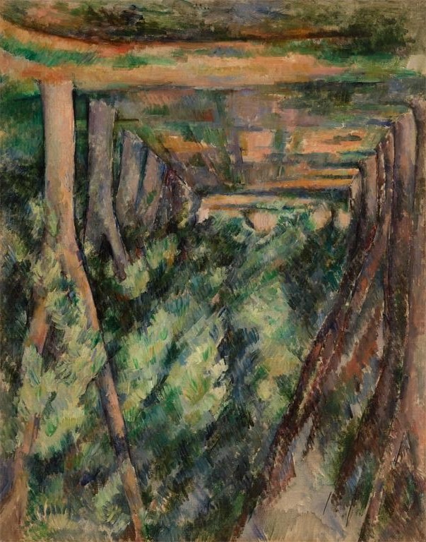
In the previous post, you examined a Cézanne painting, The Allée of Chestnut Trees at Jas de Bouffan.  

In this post, I will compare that Cézanne painting to one by Edward L. Loper, Sr.  In the spirit of full disclosure, however, I must tell you I know Ed Loper.  He taught me to paint, he insisted I attend Violette de Mazia’s class at the Barnes Foundation, and I wrote a book about his life and his work: Edward L. Loper, Sr.: The Prophet of Color.

That said, examine the following picture:

Loper, Tree Lined Street, Wawaset, 1999, Collection, the Artist
What do you see?

I suspect you readily agree that both artists started with strikingly similar subjects.  Let’s look at them side by side:


Cézanne, The Allée of Chestnut Trees at Jas de Bouffan,
1888, Oil on canvas, Barnes Foundation       
Loper, Tree Lined Street, Wawaset, 1999, Collection, the Artist


Before you read any further, make a list of the differences you detect, and think about what those differences reveal about each artist’s design.

Here is my list:

1.     The Loper painting makes the Cézanne painting look dull, cold, and dry.

2.     The Cézanne painting expresses rigidity, power, weight, order, and massiveness while the Loper painting expresses warmth, glow, iridescence, colorfulness.

3.     Cézanne, as I described in the previous post, builds a dynamic relation of planes and solid color volumes in deep space.  Cézanne’s picture says solidity, weight, equilibrium, and balance, and you, the viewer, do not feel seduced by the illustrative aspect.  In other words, Cézanne’s picture reveals an austere, abstract composition of opposing forces not an orchestration of the charming qualities of sunshine sparkling through the foliage of trees. 

Let’s focus on the Loper picture.

Here it is upside down:
Loper, Tree Lined Street, inverted

And you thought you saw similarities between this picture and Cézanne’s, didn’t you? 

Upside down, Loper’s picture is not about planes and solid color volumes in deep space, is it?  In fact, deep space hardly enters the equation.  What we see is a colorful, glowing wedge now on the upper right that actually moves down into the foreground plane as much as it “points” back into a slice of space to the right of center.  This flattened wedge sets up a series of triangular units that all point to the two white rectangles buried behind the puff of brightly glowing “foliage.”

The four slim “tree trunks” now on the right hang from a strip of diagonal patches of viridian and yellow-orange, while the five to the left bend, and curl in an awkward dance in and behind floating tufts of rectilinear strips of cool cerulean blue, orange, gold, and green.  The cool/warm contrasts create an in and out pulse, like ripples in clouds.  You do see spaciousness, but the space happens in pockets, not in a deep, dramatic push as in the Cézanne.

Loper’s picture merges elements from Cézanne and, surprisingly, also from Renoir. I say surprisingly because, when I was studying with Loper, he praised Cézanne constantly, and he never had a good word to say about Renoir.  This caused numerous, heated arguments, especially after I had studied at the Barnes Foundation and had some ammunition to bolster my position. 

As you can deduce, I loved Renoir’s work.  Cézanne left me cold.

Now that I have studied Loper’s body of work, I can mark the transition from his powerful, dramatic, dark, cubistic and fractured earlier work and his relatively new (the change occurred  about 10 years ago) lighter, warmer, richer recent work.

The transition happened because Loper derived visual ideas from both of them, and has developed his aesthetic insight through this adaptation.

Here are a few examples of the Renoir adaptations.

Notice the application of the pigment in this detail of Loper's picture:

Loper, Tree Lined Street, detail
Loper applies color in small dabs—sometimes the dabs are dots; other times they have a boxy, square look.  Like Renoir, each color unit is made of multiple colors.  The tree trunk enlarged above is built out of dark red, blue, black, green on the left and light pink, ochre, beige, orange on the right.  Like Cézanne, a line compartmentalizes the vertical, solid, three-dimensional color unit.  Unlike Cézanne, the color unit sparkles and glows, as do the “shrubs” and “foliage” behind it.  Those color units of shrubs and foliage look soft as clouds.

Here is an enlargement of one of the Cézanne tree trunks: 

Cézanne, The Allée of Chestnut Trees, detail
 Cézanne’s “tree,” built out of both strips of vertical color bands as well as hatches of strokes, expresses a “pattern” of color units that are more angular than the Loper’s as well as less rich and glowing.  Line compartmentalizes the vertical, solid, rigid, units, setting each dramatically separate from the other because of the dark relationships of cool greens and blues between them.  Their repeated split branches stand like forked tongs.  The “foliage,” constructed out of the same hatched brushwork, moves in and out more like chiseled slate than rippling clouds. They march back in space.

For further verification, look at this paining by Renoir:

Renoir, Nourmotiers, 1892, Barnes Foundation

Here is an enlargement of the tree on the left:

Renoir, Nourmotiers, detail

You can see the multi-colorfulness of the tree trunk and branches.  The paint, applied in pulled ribbons of color, glow and sparkle.  The foliage organizes into soft tufts, cotton-ball like in their lightness.  Color shimmers from light within.  Some outlining of color units occurs, but mostly one color volume flows into another.  All the units gently curve.  Space recedes because of the peek-a-boo settings of color units and the pushback of the connecting tree units on the left and the right as they join the shadow in the foreground.

Consider the following:  Loper has merged visual ideas from both Renoir and Cézanne to which he has added qualities that have interested him throughout his long career (he is 95 years old and has been painting since he was 20). 

During the summer, I will explore Loper’s use of the traditions of art.  Understanding the role the traditions play helps us, the appreciators, determine creativeness.  Creativeness determines the level of an artist’s contribution.    

However, in the next post, I set the stage by returning to a familiar question: what is a work of art?


Friday, June 24, 2011

There's an APP for That

For my 70th birthday gift, my children and grandchildren gave me enough money to buy an iPhone.  They wanted me to join the 21st century, they said.

Since then, I have become obsessed with Angry Birds, the first game I downloaded.  My practicing Buddhist daughter says the game makes her sad because she loves birds and feels terrible if they fly into windows.  In this game, they explode into cluster bombs, the better to kill the pigs. 

When I first downloaded this APP, I had no idea how to play it. It did not come with instructions.  Josh, my eleven-year-old grandson, explained the premise: something to do with pigs stealing birds’ eggs.  The birds retaliate—another feature of the game the Buddhist finds depressing.  Kaari, the six-year-old daughter of the Buddhist, eagerly showed me how to slingshot the birds and increase their destructive effect.

What has this to do with the topic of these posts?

Enjoying works of art does not come with instructions either.  In fact, if you try to find assistance in understanding the art in paintings, you will mostly find information about the subject of the picture, or its history, or information about the artist’s life, or whether the artist’s work is “relevant,” as the current debate over “Cézanne’s Card Players” reveals.

“Cézanne’s Card Players” opened at London’s Courtauld Institute last year and moved to the Metropolitan Museum of Art in New York where I saw it in the fall.  It focused on three major works of the same subject—men playing cards and smoking pipes—and included several smaller lead-up works and pencil sketches along with a full-size black and white reproduction of  The Card Players in the Barnes Foundation. 

Matthew Collings, in an article titled “Where is Cézanne Now?” summarized the viewpoints:

(1) “Cézanne was not only shortsighted . . . but, as a diabetic, probably had some retinal damage too,” said critic Brian Sewell, to explain Cézanne’s spatial distortions; (2) “the real appeal of this mini blockbuster is its modest vision of a rural pastime, rendered with infinite patience,” said Karen Rosenberg, the New York Times critic; (3) “Paint concentrates fetishistically on details of their appearance.  A bowler hat becomes glaringly phallic, so does a pipe.  In one portrait, a man sits passively, and you notice that his crotch is a black valley of shadow,” said Jonathan Jones in the Guardian. 

There’s an APP to remedy this lack of aesthetic information.  I call it the Aesthetic Perception Process.    

You have been learning how to use this APP by reading and trying out the exercises in these posts. 

For instance, if you examine the following painting, what do you see?

Cézanne, The Allée of Chestnut Trees at Jas de Bouffan, 1888,
                                                                              Oil on canvas, Barnes Foundation

Here is a short review of what you need to do:

Cézanne transformed the “real” world of a path between two lines of trees into a CSI (a color scene investigation).  He invented new subject matter, orchestrated relationships among his means (light, line, color, space), and painted the picture. 

To appreciate this work of art, we come into this equation at the end: at the picture.  We study the picture, describe the relationships, see what new matter the artist created, and state the intent: the picture idea.  When we reach this point, we understand the visual aesthetic experience that transformed Cézanne’s “real” world into a CSI (a color scene investigation). 

Now we can appreciate (enjoy via understanding) the art in the picture.  We experience the picture aesthetically.

If you feel rusty because you have not done this work recently, try this:  look at the picture upside down.

Cézanne, The Allée of Chestnut Trees at Jas de Bouffan, inverted

Think about your first reaction as you looked at this upside-down painting. 

My mentor, Edward L. Loper, Sr., showed me this trick when, as a beginning painting student, I struggled to finish a painting.  “Turn it upside down,” he commanded. 

Why?

Upside down, the subject loses its grip, and the plastic structure of the picture becomes apparent, its substance, as John Dewey calls it.  The subject is seductive, as you have all discovered, and it can block you from appreciating the color clues.

You can’t try this in a museum, but you can do it with a print or digital image or a painting you own. 

Upside down, a key feature of this painting appears—that deep space created by the clothespin-like bands closing off the space recession on the left and the right. Like thick, muscular, sinewy tentacles of an octopus, the tree branches force the eye into the pie-shaped wedge of space between them.  The foliage, transformed into slanted, irregular volumes, step back into that space. Once into the deepest recess, marked by the small ochre semi-circle, strips of orange, ochre, and green build a platform beneath the final color unit of upright horizontal bands of terracotta red and gold.

Notice how the inverted tree on the right, like a rigid tuning fork, stands out because of its lighter pink-tan color and connects with the curve of that glowing rolling band of emerald green, terracotta red, and ochre strips.

Right side up, the picture takes form: the foreground now becomes a step in and up to the tree on the right.  From there, notice the inverted ˄’s between the tree trunks that morph into V’s as the branches rise.  A clue.  Where else do you see those V’s?

What effect do they produce?

This dynamic relation of planes and solid color volumes in deep space, Dr. Barnes argues, is the principal theme of Cézanne’s paintings.  Solidity, weight, equilibrium, balance—all revealed within a simple subject of a road winding through trees. 

Keep looking.  I know you will find more and more color clues and feel yourself drawn into the experience of discovery.  If you feel so moved, share your perceptions with us by commenting here or, if you prefer more privacy, send me an e-mail.

In the next post, I will return to this painting by comparing it to Tree Lined Street, Wawaset, a painting by Edward L. Loper, Sr.


Sunday, January 2, 2011

The Archimboldo Dilemma


The Archimboldo exhibit at the National Gallery of Art (Archimboldo, 1526-1593, Nature and Fantasy) makes people happy.  On a crowded Tuesday during the week between Christmas and New Year’s, I marveled at the throngs of visitors cheerfully enjoying the work, especially the kids.  I overheard none of the usual whining: “I’m tired”; “Can we go now?”

As Blake Gopnik wrote in The Washington Post (September 17, 2010, C08), these pictures have a “huge ‘wow’ factor.”

Therein is the rub.

For instance, “Spring,” shows the face of a woman smiling.  Her skin, hair, and clothes, however, are composed of the petals and stalks of spring flowers.

1573, Oil on canvas, 76 x 64 cm, Louvre

 “Summer,” presents a face constructed out of different kinds of summer fruit and vegetables. 

1573, Oil on canvas, 76 x 64 cm, Louvre
For practitioners of aesthetic appreciation, we must work hard to get past the extraordinary illustrative appeal of these pictures.  We must work hard to get past Archimboldo’s superb technical skill, his ability to render minute and exact detail, to fool us into believing we are seeing real peaches, apples, fish, flowers, etc. and not oil paint on wood or canvas.  We must work hard to get past the cleverness of the visual puns: in the “Vegetable Gardener,” we see a dark green bowl filled with various root vegetables.  Upside down (assisted by mirror-topped pedestals) the bowl full of vegetables turns into a chubby-faced head.
ca. 1590, Oil on wood, 35 x 24 cm, Museo Civico Ala Ponzone, Cremona
I laughed aloud in front of “Vertumnus,” Archimboldo’s portrait of Rudolph II, rendered in fruits, flowers, and vegetables representing the four seasons.  A woman next to me felt the need to correct my mirth: “That’s not meant to be funny,” she told me with great authority, “it is about imperial dominion over all the world’s bounty.”  I chose not to argue with her.

1590 or 1591, Oil on wood, 68 x 56 cm, Skokloster Castle, Sweden
If we want to understand the aesthetic meaning in this work, we must look for and perceive the qualities of things rather than the things themselves.  The “joke” in these pictures is that faces are made out of fruit, flowers, or fish.  No matter what the subject was, no matter how the artist manipulated things we recognize, we still must confront the picture.  We must read the color.

Archimboldo does transfer some qualities into his pictures, but these qualities are, for the most part, transferred from the Florentine tradition (the clean-cut spatial intervals, the labeling color, modeling achieved by light and shadow).  The outstanding feature of his work is bizarre arrangement of subject facts.  Much later, surrealists jumped on this idea.

However, Archimboldo did not “invent” it.

Look at this picture:


Giovanni de Paolo, Saint Nicholas of Tolentino Saving a Shipwreck, 1457, Sienna, PMA

This 15th century Italian painting in the John G. Johnson Collection at the Philadelphia Museum of Art was originally part of an altarpiece depicting Saint Nicholas of Tolentino and his miracles commissioned for a church in Montepulciano in Southern Tuscany.  Giovanni de Paolo may have had access to first-hand accounts of the miracles because the government of his hometown of Siena owned a copy of the testimony of witnesses to the event.  However, he added the naked figure swimming in the foreground enticing the sailors to steer off course, he levitated the ship and the Saint’s head, swept the flying sails forward and back in the black space, and rounded the roiling waves into receding mountaintops. 

When I first looked at this picture, I said to myself, “this artist was a surrealist.”  Sure enough, I discovered this picture was included in a group of “forerunners” in the exhibition titled Fantastic Art, Dada, Surrealism held at MoMA in 1936.

Nevertheless, whether Archimboldo is the “grandfather” of surrealism, or the first painter of still life subjects, or his work investigates naturalism, the grotesque, or imperial order, it is our job to ask if he makes works of art.  And then defend our answer.

In discussing the manipulation of subject facts, Miss de Mazia argues in her essay, “Transferred Values: Part I—Introduction” (The Barnes Foundation Journal of the Art Department, Autumn, 1978, Vol. IX, No. 2, p. 26), “…[the] components are, in the main, re-presentations, literal renderings, of recognizable things, as opposed to qualities; and, secondly, they are juxtaposed, incongruously or not, without any transference of any characteristic or trait of one into the structure, meaning or actuality of any other.” 

In other words, the Emperor has a pear where his nose should be, and apples for cheeks, but in neither case is the visual meaning of the item—pear or apple—transferred into the matter that makes up the head; they are added on, and they combine with the other fruits, vegetables and flowers to construct the unit that says head of Rudolph II. 

Let’s try to get a handle on this.

Compare Archimboldo’s The Librarian (1566) with de Chirico’s The Evil Genius of a King (1914-15).

Oil on canvas, 97 x 71 cm, Skokloster Castle, Skokloster

Oil on canvas, 61 x 50.2 cm, MoMA

Use all your tools: examine the orchestration of light, line, color, and space.  Describe the relationship of the illustrative, decorative, and expressive aspects.  Define the picture idea in both.  Think about similarities and differences.  While both artists are indebted to the Florentine tradition, think about what de Chirico does to and with Florentine visual ideas like architectural massiveness and spatial variations that make them his and new. 

Then, let’s talk. 
  

Friday, December 24, 2010

Time Out

You now possess all the tools necessary to uncover the art in art.

Mastery takes practice, practice, and more practice.

During late December and through January, I suggest you visit at least one museum.  Bring someone with you.  Do not accept the offered headphones. 

Try this instead: go through one of the exhibits I list in this post.  Go through it quickly. Briefly look at all the work exhibited.  Take notes.  Jot down your reaction, if you have one, to any of the pictures in the exhibit.  Don’t obsess over this.  Here is a possible set of notes:

1.     I hate it.
2.     I love it.
3.     YIKES! What is that about?

Include next to each entry the title and/or the number of the picture so you can find it again.

After you have visited the entire exhibit, select from your notes one or two pictures you really want to get to know.  You may have hated or loved the picture.  That does not matter.  Your goal is to get to know why you hated it or why you loved it.  You want to know what, in the picture, elicited that reaction. 

Then return to each of them, use the tools you have learned, and look at each of them carefully.  This will take some time and a lot of effort.  If you have brought a companion with you, explain to him/her what you see.  Involve him/her in the process.  Again, take notes.

After scrutinizing at least two works, and if you still have time and energy, return to some of the other pictures you listed in your initial “tour.”

If you feel exhausted and satisfied, leave and get something to eat.  If the exhibit intrigued you and you want to experience more of it, plan to go back.

In other words, trust your perceptions and work with your feelings as you move toward the aesthetic goal post: the delicious satisfaction attached to understanding the visual meaning in a work of art. 

Here is a short list of exhibits closing soon in the mid-Atlantic area.  Any one of them will provide excellent practice. 

If you visit an exhibit and you wish to share your experience, please do so by writing a comment here.  Ask any questions your exploration aroused.  I’d love to know your reactions.

I have already visited a few of these exhibits, and I intend to go to a few more in the next several weeks.  I also will be traveling to Nice in mid-January and visiting: the Musée Matisse in Cimiez; the Musée du Message Biblique Marc-Chagall; the Musée Picasso, Antibes; the Musée Renoir (formerly Les Collettes, Renoir’s home for the last 12 years of his life); the Chapelle du Rosaire in Vence (its black-on-white tile drawings, stained glass windows, chasubles and alter designed by Matisse); and as many others as I can get to in a week.

I should be ready to add new posts by early February.  These posts will fine-tune the concepts I have already explained and give you more practice in using the tools of discovery.

Washington, DC


National Gallery of Art

Arcimboldo, 1526-1593: Nature and Fantasy

September 19, 2010-January 9, 2011

From Impressionism to Modernism: The Chester Dale Collection

January 31, 2010-January 9, 2011

Phillips Collection

Side by Side: Oberlin’s Masterworks at the Phillips

September 11, 2010-January 16, 2011
This one deserves some explanation.  The exhibition showcases an unconventional hallmark of The Phillips Collection, the mixing of works of different periods and nationalities in changing installations to reveal new affinities between works of art. This approach reflects the views of museum founder, Duncan Phillips (1886–1966), who saw the history of art as a conversation through the ages among artists and works of art. In his collection of contemporary art, Phillips included several old masters, including Giorgione, El Greco, and Goya, and an early wish list included the names of others.
Going to the heart of Phillips’s claim, among Side by Side’s loosely themed groupings is one that brings together artists who copied paintings by their predecessors in the Louvre. The Allen’s Rubens appears with Luncheon of the Boating Party (1880–81) by Pierre-Auguste Renoir, who is known to have copied works by Rubens. In the second half of his career, after abandoning impressionism, Renoir again looked to Rubens for inspiration. Related works in this section of the exhibition are from the Phillips, by Berthe Morisot, Edgar Degas, and Ferdinand-Victor-Eugène Delacroix.

New York City


Museum of Modern Art

Abstract Expressionist New York

October 3, 2010-April 25, 2011

The Metropolitan Museum of Art

Man, Myth, and Sensual Pleasures: Jan Gossart’s Renaissance

October 6, 2010-January 17, 2011

Miró: The Dutch Interiors

October 5, 2010-January 17, 2011

Cézanne’s Card Players

February 9, 2011-May 8, 2011

The Frick Collection

The Spanish Manner: Drawings from Ribera to Goya

October 5, 2010-January 9, 2011

The King at War: Velázquez’s Portrait of Philip IV

October 26, 2010-Janauary 9, 2011

Baltimore


Baltimore Museum of Art

Andy Warhol: The Last Decade

October 17, 2010-January 9, 2011