Wednesday, June 12, 2013

The Poop in Plein-Air Painting


Last week, on a clear, dry, 70-degree day, I packed my car with all my painting gear and happily headed for the Red Clay Reservation, a private land trust adjacent to Mt. Cuba in Hockessin, Delaware. I have permission to paint there.

Once there, I drove deep into the park, pulled my car off the gravel road, and then I dragged my paint box, bag of necessities (like paper towels, linseed oil, and turpentine), a small, outdoor collapsible stool, and my stretched canvas a considerable distance over a grassy field to my spot. (I need to say here that, since February, I have acquired a pain in my neck, and this makes the physical effort required much more intense).

However, my subject is high above a valley with a view of a small pond and springhouse. I am alone with the view, the singing birds, and the breeze. 

This photo shows you my subject as it was in early May:


As I started to set up my French easel, I noticed a pile of animal poop nearby. I set up well below it, and I told myself I knew it was there, it surprisingly did not smell, and I would be fine.
About an hour later, as I backed up to review the work I had done, I stepped right in it.
Plein-air painting instigates challenges like this!
I wonder, when something like this happens, why I have been painting outdoors for more than 40 years and why so many other painters do as well. Why do we leave the warmth, safety, and comfort of our studios to paint outside where we confront changing light, unexpected storms, distracting onlookers, insects, and the messy droppings of animals?
In addition, there is the cost factor. A few weeks ago, I flew to California to visit a nephew in Santa Monica, to go to see paintings in area museums, and to scout for possible painting sites.

Look at this photograph of a salt marsh near Malibu:


I fell in love with it. Within an instant, I transformed it into a subject and felt that mixture of interest, excitement, and impatience to start painting. Then I thought about what it would cost me to return: airfare, about $600; rental car, $284; hotel, $2200; restaurants, c. $500—all together, a small fortune. Add to that its location: a long walk partly on a wooden walkway, then over sand; no shade; no ocean breeze due to its configuration. I would not last very long in the intense hot sun, even with an umbrella, and even at dawn. In addition, if I drove there from anywhere close by, I would struggle with the snarl of traffic on legendary Route 1, the Pacific Highway. 
I ruled it out.

As I think back to my many painting trips (from Key West, Florida, to Newfoundland, Canada, on the east coast; to the Rocky Mountains of Colorado and the Canadian Rockies; to France, Italy, Spain, Belgium, and Holland), I have spent years searching for new visual experiences to juice my creative spirit. 

However, dispiriting events can conspire to test the strongest drive: in Nova Scotia, near Peggy’s Cove, I tried to paint in West Dover, a small fishing village, and relentless fog, day after day, tortured me. In a campground near Gloucester, MA, I lived in a tent with my husband, three kids and a dog, when a hurricane threatened a direct hit, and we had to pack up and go home, my painting unfinished. I have had paintings blow over from a gust of unexpected wind and land face down in sand. I have persevered in numb chilling cold; I have traveled to Saint John’s, Newfoundland, could not find a subject I liked, and came home defeated.

I could go on listing the non-cooperation of nature or spirit. However, people also can get in the way.
In 1892, Renoir wrote a letter to Berthe Morisot. He said, “Landscape is becoming more and more of a torture for me, all the more because it’s a duty; evidently it is the only way to gain some understanding of one’s métier, but I no longer can plant myself out of doors like a street entertainer.” (Rouart 1950, p. 170)
I know how he felt.

In 2007, I painted a picture at Lake Louise in the Canadian Rockies, and each day I found myself surrounded by curious tourists. Some asked to watch; others asked to take my picture; others asked to stand next to me while someone else took our picture; others asked me to explain what I was doing.

In that same location, gnats swarmed all over me and stuck to my painting.
I persevered.

Why?
Because despite all the interruptions and the gnats, I made this picture:


Bauman, Lake Louise, 2007, Private Collection

Before we study it, here is a photograph of my subject and a photograph of me painting the picture:


If you react as I do, you are thinking: how did she make that painting from that subject?

I’ve discussed the answer to this question in a previous post, What Dreams May Come.

Click on the title if you wish to review how an artist transforms a subject into picture.
For now, let’s look at the picture upside down:


1. The picture divides into 4 quadrants, demarcated by an X-shaped composition

2. Mostly vertical multi-colorful bands that were pine trees and/or reflections build a series of decorative motifs.

3. The now bottom pyramidal quadrant (that was snow covered mountain) recedes slightly.

4. The two side quadrants push forward.

5. The now top V-shaped quadrant (that was the lake) displays a rich, cool series of greens, blues, and lavenders. This unit slides back in space while the pyramidal dock and red dome-shaped rowboats on it move forward and hang, suspended, in the foreground plane.

6. Within each quadrant rhythms of stripes and bands move back and forth in space reinforcing the picture idea.

Simply put, at my first interested look, I converted a much photographed tourist attraction into a decorative visual idea. 

Despite the cold, the gnats, and the tourists, the working out of my idea as I made my picture produced such an intense, concentrated focus, I felt totally transported to, and a part of, the new color world I created.

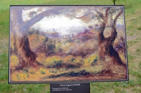
I suspect Renoir felt a similar aesthetic charge as he made Paysage des Collettes, a painting based on a subject he encountered in his Cagnes garden.

Here is a photograph I took of his subject when I visited Renoir’s farmhouse in 2011:


Here is the plaque that marks the spot Renoir worked on the painting:


Here is the painting:


Renoir, Paysage des Collettes, 1910, Musée Renoir

I urge you to study this painting and make your own list of what Renoir did to and with his subject. I assume you agree that there is very little in the photograph that predicts the outcome—the painting. The visual idea revealed in the painting crystalized for Renoir because of his background, interest, and sensitivity. 

Here is another example, a tree in Vence used by Soutine for seven different pictures. 

In 2011, I took this photograph of the tree:


Here is a photograph of the plaque marking the spot Soutine made the painting:


Here is one of the paintings Soutine made using the tree as his subject:


Soutine, Tree of Vence, c. 1929, Private Collection

All through the Nice area you can find plaques marking the locations where Renoir, Soutine, Modigliani, Derain, Cross, and others made their pictures. You also can do this in Aix where Cézanne lived and worked; you can do it in Arles and Saint-Remy and many other areas in France where van Gogh worked. Usually titled “Walking in the Footsteps of….,” the plaques mark areas where each artist stood and made pictures. And you can then compare the exact subject (somewhat degraded over time by the encroachment of houses, growing trees, and undergrowth) with the resulting painting.

Yet, interesting as it is, it does not answer my original question: why do we do it? 

I do it because nature provides “visual gifts.” These gifts arrive unbidden and unexpected—a certain slant of light or a particular color. When I feel particularly dull, when the voice in my head tells me I have no idea what I am doing; when I am in the muddle (a term coined by many writers describing the creative process as having a “beginning, a muddle, and an end”), I mostly go on faith—and sometimes something wonderful happens—a breeze turns leaves just the way I need them, a cloud fills a blank space in the sky area of my picture and is just the right shape, or, in Lewes, Delaware, a fisherman sits down on his overturned bucket and throws his line in the water at the exact spot on the dock I need a color shape for my picture. 

Here is the picture:


Bauman, Fishing in the Lewes Canal, 1985, Private Collection
As it turned out, my fisherman, feeling my eyes on him for several hours, stopped to talk to me. His name was Jim Sills and, a few years later, he was elected mayor of Wilmington. For almost 30 years, we both enjoyed telling this story.

Nature provides “visual gifts” that both give me ideas and teach me how to see, and working directly from nature is my way of saying thank you for the beauty and visual suggestions it provides for me to use. 

For example, here is a Renoir painting that captures the sparkle of sunlight:


Renoir, In Brittany, 1886, Barnes

Here is a cropped image of the shrubs on the left:


Here is a photograph of Winterthur in late March. The trees shimmered in the late afternoon sunlight, and I would not have stopped to enjoy them if I had not known Renoir’s work.


In March, I shot this photograph of the March Bank at Winterthur. It caught my eye because I knew the van Gogh painting, Undergrowth. When I spotted the March Bank, I thought, “Van Gogh would have loved this.”

Here are the two pictures:


  Van Gogh, Undergrowth, 1889, Van Gogh Museum, Amsterdam

In a letter written to Emile Bernard in 1905, Cézanne sums it up this way:

“The Louvre is the book in which we learn to read. We must not, however, be satisfied with retaining the beautiful formulas of our illustrious predecessors.
Let us go forth to study beautiful nature, let us try to free our minds from them, let us strive to express ourselves according to our personal temperaments.
Time and reflection, moreover, little by little modify our vision, and at last comprehension comes to us.”


Monday, February 25, 2013

Insight Rewards the Work of Art


At the end of my previous post, “A Cuban Adventure Totally Objective,” I said I would revisit the need to transform subject facts into picture facts if appreciating the art in painting is the goal. 

Since then, I fell into that blank space writers unhappily know all too well: I had no idea how to approach this topic without repeating past posts.  Its other name is writer’s block.  So I wallowed in this misery until this morning.  Then, like a gift, as I ran in the freezing air, I connected two disparate exhibits: a Matisse exhibit at the Met I visited a few weekends ago and a new exhibit at the Met, “Impressionism, Fashion and Modernity,” that opens February 26.  Roberta Smith summarized the new one, “Impressionism,” this way: “In fresh, groundbreaking ways this show details the entwined rise of modern painting, modern fashion and modern (upper middle-class) life over some two dozen years of rapid change in Paris, 1862-1867.” (New York Times, 2/22/13, pp. C1 and C21).

In November, Roberta Smith summarized “Matisse: In Search of True Painting” this way: “As ravishing as it is succinct, it skims across this French master’s long productive career with a mere 49 paintings, but nearly all are stellar if not pivotal works…. The textbook simplicity of this format is irresistible. The visual self-schooling particular to looking at art kicks in, and almost before you know it your eyes are off and running, darting back and forth, parsing differences in style, brushwork, color, detail and overall effect, the expression of emotion that Matisse said he was always after.” (New York Times, 11/30/2012, p. C21 and C24.) 

In other words, the “Matisse” exhibit encouraged viewers to do the work of art (with work used as a verb, since what we do is definitely labor intensive).

In the “Matisse” exhibit, Matisse’s painting “The Large Blue Dress” hangs to the left of the skirt Lydia Delectorskaya, his model, wore while posing. Rebecca Rabinow tells us, in the catalog to the exhibit, Lydia made the dress herself: “a blue gown with leg-of-mutton sleeves, embellished with white organza cuffs and ruffles along the edges of the overskirt, neckline, and bodice.”  (“The Woman in Blue,” Matisse: In Search of True Painting, 2012, The Metropolitan Museum of Art, pp. 142-143.


Matisse, The Large Blue Dress,1937, PMA

Skirt sewn by Lydia Delectorskaya, and worn by her while posing for Matisse's The Large Blue Dress, ca. 1936. Silk with cotton lace trim. Private collection


Matisse used this skirt.  He converted it into oil paint (color) and brushed that color onto a canvas (a flat surface).  The created color unit (no longer a skirt, is it?) now serves as one visual clue to the aesthetic meaning of the picture. 

If you go to the Met website and you listen to a short video describing this painting, you will hear the curator, Rebecca Rabinow, also describe the photographs a photographer Matisse named Matossian made to document his progress.  Rabinow says: “The sequence of photographs show Matisse first presenting Lydia within the interior of his studio. But as the painting evolved, it becomes less about him trying to portray a specific person, as opposed to creating or conveying [the] emotion that he has. These photographs show not studies for the painting, but the actual evolution of the canvas. The skirt, the dress—it all changes dimensions. Shadows climb up. The settee's arms become arabesque curves. He's not in the least bit interested in a naturalistic representation of what he sees. He used [the dress] … to express the emotion that he felt when he looked at an object. He's trying to capture [its] essence.”  (Click here to view the video and listen to Rabinow’s description:  Matisse.)

Let’s examine some key words she uses: “the emotion that he felt,” and “trying to capture its essence.”

If I synthesize her language even more, the key words become “feelings” and “essence.”

What do “feelings” mean in this context?  And what is the “essence” of an object?

In Dr. Barnes and Violette de Mazia’s vocabulary, feelings are the broad human qualities an artist perceives in an object (feelings like power, drama, fluidity, delicacy), that become the “essence” of the object as an artist transforms a subject into a picture idea. 

It is as if the artist says, “I feel a strong sense of solidity in this apple,” or “I feel such delicacy and fragility in this landscape.”  At this moment, whatever the object was (apple, chair, hat, skirt, tree), it becomes a color unit and is orchestrated into a color composition.  The artist creates an entirely new object, a picture.  And embedded in the picture is the meaning of the artist’s aesthetic experience.

My classroom students tell me they know this.  They feel insulted when I remind them that a color unit is not the same as what it represents.  But when they look at a painting, they continue to describe the colors on the flat surface as if they were trees, or apples, or figures. 

Let’s look at this another way.  In one of the last essays Violette de Mazia wrote, she examined the use of headdresses in painting.  She described “hats” used by Cézanne, Renoir, and Matisse, not the same hats, but the use of “hats” as they functioned in each picture—in the   broad human values expressed as revealed by the qualities each “hat” embodied.

Here is each painting:

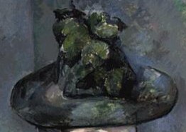
Cézanne, Madame Cézanne with Green Hat,1891–1892, Barnes
Renoir, The Artist's Family, 1896, Barnes
Matisse, Seated Riffian, 1912, Barnes


De Mazia says: (1) In the case of the Cézanne, the hat, a platform topped by a rising column, is as if made of stone or metal—hard, solid, weighty, frozen—and provides, at the top of the picture area, a counterbalance to the lap and hands at the picture’s lower portion, at the same time equilibrating the thrust and counter-thrust of the architectural components of the figure:


(2) The hat of the standing woman in the Renoir, made of lush colors, as of a garden of flowers, is a voluptuous volume that is echoed in the small tree at the side, in the houses, in the woman’s blouse and skirt, in the child’s bonnet; it is, in addition, one of a group of hats that includes the hat on the boy and the hat on the girl, all three of which, by their relationships to each other, emphasize the closed-in effect of the composition and the contrast of axial planes created by the presentation of the figures:


(3) In the Matisse, the headdress is essentially a set of more or less parallel, curvilinear, contrasting bands of color that are in keeping with and complete the theme of bands and stripes in the rest of the painting. (“The Form of Seurat’s ‘The Models,’” Vistas, Vol. V, No. 1, 1990, pp. 9-10)


De Mazia’s point: the transformation of “hat” into color unit fits the purpose and the context of the picture.  It is not the artist’s job to record the kind of hat the figure wore, but “to record the aesthetic character it acquired from the artist’s imaginative perception of a situation in which the hat plays a part and to record it in terms of broad human values.”

In Cézanne’s picture, power and architectural equilibrium are expressed, and the color unit that says “hat” fits that purpose; in Renoir’s picture, fluidity, warmth, and richness are expressed, and the units that say “hats” fit that purpose; in the Matisse, the contrast of exotic color drama comes about by pattern of shapes, and the “hat” fits that purpose.

Now examine the Matisse painting that started this exploration: The Large Blue Dress.

Here it is upside down:


Matisse transformed Lydia Delectorskaya wearing her blue dress into a series of symmetrical arabesques, flattened bright color units, set in a subtle space recession.  He uses single flat colors evenly filling a pattern of clean-cut areas—an idea that eventually leads him to paper cut-outs. 

For the artist, the conversion of subject to picture idea occurs in magic moments that change everything.  While Matossian’s photographs reveal some of the revisions Matisse made to this picture over a period of time, they do not account for the why.  The picture holds the answer, and we discover it by uncovering the art in it.

Notice the following pictures facts when I slice the picture in half.  First, the left side:


1.     The background black grid sets off the “swan’s neck” yellow arabesque, followed by the red arc with its pink linear pattern, and the blue-gray curve of the “skirt,” all units sliding one behind the other.

2.     The white “skirt’s trim” rhythmically echoes the yellow arabesque.

3.     The internal pink linear pattern in the red arc is rhythmically echoed in the gray rectangle above and to the right of the black grid’s top arc.

4.     The curvilinear pattern of the “skirt’s trim” is echoed in the smaller yellow rectangle to the left of the gray one.

5.     The red background repeats the grid of the black arc, but with larger rectangles.

6.     The “black/white” motif occurs again in the dots of “beads” wrapping around the large leaf-shaped “hand” with its splayed “thumb.”

7.     All the color units move backward from the bulbous shoulder, arm, and skirt in a series of curvilinear, dovetailing shapes.

8.     The red arc sets the mid-space and allows the background red to move behind the top yellow rectilinear color areas.  

Now examine the right side:


1.     Now the red background, the shape of a larger arc, rhythmically balances its twin on the left while, at the same time, its angular top bends inward like the number 3. 
2.     The yellow arabesque, pushed to the edge of the right side of the picture, hugs the red arc while the gray-blue “sleeve and cuff” and the ball-shaped shoulder slide behind it.  
3.     The “skirt’s trim” now mirrors the yellow “S.” 
4.     Each color unit, as on the left, starting with the “trim,” moves backward in space ending in the black grid on the right.  However, that black-grid background now pushes further back than on the right because of the configuration of blue-gray arm sandwiched between the yellow “S” and the red “3.”
5.     The gold open circles of the “necklace” connects to the semi-circle of gold hair and continues the motif of black/white circles enveloped in the downward flow of the “foliage-shaped hand” that echo the yellow “flowers” behind the oval head.
6.     The red “mouth” sets the spatial key for all the red units.  Take a good look at those spatial rhythms.  I think you will enjoy the experience. Or spend some time with the pinks lined in white of the face, neck, and hands to enjoy how those repetitions echo the white/gray motifs in the “dress’s” trim, then reverse in the dress’s gray/white units.

I could go on, and the surprise of this statement is two-fold: at first glance, this picture looks effortless, facile even, simple enough to see in one quick look.  However, only when you look at it long and carefully do you see the decorativeness of the flattened, compactly wedged planes, the balancing of foreground and background into a single, rhythmically organized surface, and the arabesques of areas and lines.

Insight rewards the work of art.  Insight allows us to discern the true nature of a situation and to grasp the inward or hidden nature of things.  As I said in a previous post, insight makes the invisible visible (see Making the Invisible Visible).

I hope you visit the Met to see both exhibits.  “Impressionism, Fashion and Modernity” opens February 26 and closes May 27, 2013.  “Matisse: In Search of True Painting” closes March 17.  For more information, click here: The Metropolitan Museum of Art.


Friday, February 8, 2013

A Cuban Adventure Totally Objective


In the last post, A Cuban Adventure Not Totally Objective, I began a description of El Rapto de las Mulatas (The Abduction of the Mulatto Women), a 1938 painting by Carlos Enríquez.

I asked you to analyze the painting and share with me your aesthetic discoveries, and I am happy to report many of you did.

What follows is my synthesis of your perceptions and mine.

Here is the painting:

 
Carlos Enríquez, Abduction of the Mulatto Women, 1938, oil on canvas, Museo Nacional de Bellas Artes, Havana

The picture is an orchestration of light, airy, translucent color masses that twist, turn, and spin in a compressed space.  Right side up, as it is above, that much is clear.

Here it is upside down:


Upside down, the picture divides into two sections: slightly above center, a semi-circle separates the now lower half from the upper.  The lower half consists of lighter, transparent, almost diaphanous volumes rising upward and bulging forward to the right, crowning in the “hat.”  Notice how the “hat” to the left sinks back in space; how the head of the “mulata” between the two “policemen” is the furthest back in space, nestled in a dark crevice; how the oval, bent-back head of the “mulata” on the right floats forward and holds its position in space just below the “policeman” to the right, and her “body,” a cone of deep reds, bulges up and then recedes back completing the curve that divides the picture. 

The now bottom of the picture, like fluffy blue/pink cotton-candy, wisps, curls, and floats creating pockets of space made deeper by the vertical, delicate, curving “palm trees” as they set off the dove-tailing landscape of rolling hills in the far distance.

Look carefully at how far back the space recedes by comparing the “hat,” right side up, to the space created to its right:


Even the “rifle,” its black barrel dramatically pointed back and right, guides us both backward and across this rolling, blue-pink configuration of receding planes.

And while we are here, examine the brush strokes that build that “hat.”  A few of you detected a Cézanne-esque application of short, horizontal strokes that become vertical bands, building its volume.  Notice, too, how the brim is more of a bowl, with the crown of the hat sinking down into a pocket of space and revealing the “eye” and “nose” of the policeman through an open space made by the rising edge of the rim’s golden band.  Notice, also, that the Cézanne brush strokes do not build a solid, set volume, but rather a light, airy one.  Notice, as well, that the vertical alternating blue/gold bands that structure the crown of the hat are rhythmically repeated in the double row of “palm trees” in the far right of the picture.

Now look at this detail of the lower section of the top part of the picture, as the figures meet the two horses:

 
Swirls of color volumes swim across the picture plane.  The breasts and shoulder of the “mulata” to the left, a bubble-like mass of transparent, muted color, floats between the flattened “policeman’s” body and her thrown-back head.  Her oval “head” contrasts in both color and value to the warmth, lightness, and transparency of her upper body.  In tones of tan, black, gray, and green, the oval volume also sinks down into, and is encircled by, a crown of black.  The undulating  color mass around her completes the color unit, and it consists of the “policeman’s” hand and arm pressing downward and both her arms rising upward, fingers splayed and pointed, the spaces between them rhythmically echoing the men’s bullet vests.   

Wedged between the two “men,” the other “mulata,” is folded legs to chin, and gripped in a two-handed vise.  Her rounded thighs and knees duplicate the rounded, bubble motif of her companion’s upper body, but in Cézanne-esque brushstrokes of heavier, darker tones.  Painted similarly to her companion in tones of blue-gray and tan, her oval face slips slightly behind the left “policeman’s” shoulder. 

To her right, the second “policeman” melts, cubist piece by cubist piece, into the background.

That’s merely the top half.

Now let’s look at the bottom part:


All the color units crowd the frontal plane.  No space recedes between any of the color units.  The horses: one frontal, a swirling volume of blue-grays and tan; the other (to the right) seen from the rear, bulging volumes of reds, oranges, and browns.  Blue-gray wisps fly from the left “horse” and float to the right.  On the top left, the “mulata’s body, a bulging red/orange mass pushes forward and down, closing off the space.  On the right, the “horse’s” rump pushes left against the central “horse,” dramatically and forcefully squeezing it forward as it explodes outwards into the frontal plane.    

Moreover, the color masses, remarkably luminous in combination with strong dark and light accents, do not hark back to Rubens.  Enriquez may have used a subject similar to The Rape of the Daughters of Leucippus, adapting it to a historically Cuban experience, but he did not borrow Rubens’ bright color or textual and fleshy fidelity. 

Look at the Rubens again:

Rubens, The Rape of the Daughters of Leucippus, c. 1617, Alte Pinakothek, Munich

Enriquez stresses expressive qualities of movement, drama, forcefulness and power—Cézanne-esque qualities with similar subtle colorful modulations—but none of Cézanne’s architectonic setness or solidity. 

His color and swirl has much in common with Pascin’s.

Look at the following pictures to see if you agree:


Pascin, Southern Scene, 1915, Barnes
Pascin, Cubam Hospitality, 1915, Barnes
 
Pascin, like Rubens, expresses an activity of swirling rhythms and he models volumes by contrasting bands of color.  Like the cubists, he uses angles and planes to orchestrate those units in space.  He adapts Renoir’s lightness, delicacy, and fluidity of color.  Dr. Barnes argues that Pascin creates a “sort of swirl which, though less colorful than Rubens’, and less powerful than Tintoretto’s is akin to both.” (The Art in Painting, p. 376).

That said, Pascin’s color has a pastel quality.  Enriquez color does not.  Enriquez color looks to be the result of applied strokes of tinted air, as though made out of exhaled breath, not pigment.  The marvel is that these delicate, light, airy, translucent color volumes also forcefully and dramatically writhe, swirl, and pulse thereby, in El Rapto de las Mulatas, legitimately linking subject facts to picture facts.  
In my next post, I will review that last sentence.  At the end of last semester, as I read my students’ final papers, I noticed how much trouble they had stating the picture idea for the painting they were analyzing.  While they all were able to discuss their picture as made of colors on a flat surface, when they described those colors, they could not move past what they “represented.”  They talked about hats, not a color volume in space, for example.  This conversion from subject to subject matter, from what we refer to as everyday reality to visual perception, is no easy task.   


Wednesday, January 30, 2013

A Cuban Adventure Not Totally Objective


Last week,  in the Havana Museum of Fine Arts,  I listened to a guide describing El Rapto de las Mulatas (The Abduction of the Mulatto Women), a 1938 painting by Carlos Enríquez.

I explored the picture as he talked about Enríquez, but when he said, “Enriquez married Alice Neel in 1925,” I started listening.  Alice Neel.  I knew her work, and I recalled some of her life: hard, I remembered, with the death of one child and separation from another. 

I knew none of this mattered if what I wanted to understand was the art in the Enríquez painting, but I, nevertheless, being human and curious, could not wait to trace the story.

As soon as I arrived home, I did.

Alice Neel, born to parents from the Philadelphia area on January 28, 1900, attended the Philadelphia School of Art and Design for Women, now Moore College of Art and Design.  Anne d’Harnoncourt wrote (in the catalog forward to the 2000 exhibition marking Neel’s 100th birthday), Neel was the artist “who took the preferred genre of her Philadelphia forerunners, Charles Wilson Peale, Thomas Eakins, Cecilia Beaux, and Mary Cassatt, into the modern age.” (p. 8).

In July 1924, Neel attended the Chester Springs summer school of the Pennsylvania Academy of the Fine Arts where she met the Cuban artist Carlos Enríquez (1900-1957), son of a prominent family in Havana.

In the spring of 1925, Neel graduated from the Philadelphia School of Design for Women, and on June 1, she married Enríquez in Colwyn, Pennsylvania.  However, she was unwilling to travel to Havana with him.  He eventually left for Havana, where he took a job with the Independent Coal Company and participated in his first exhibition with a group of young artists who became the leaders of the Cuban vanguardia movement. 

In 1926, Enríquez returned to Colwyn to convince Neel to join him in Cuba.  She traveled to Havana with him, and they lived with his parents in their house in El Vedado, later moving into their own apartment on the waterfront, and then to a rented house in the neighborhood of La Vibora.  Neel had her first solo exhibition in Havana, and on December 26 gave birth to a daughter, Santillana del Mar Enríquez.

Several exhibits with Enríquez followed, but in May, Neel returned to Colwyn with Santillana.  That fall, Enríquez joined them in Colwyn, and the family moved to an apartment on West 81st Street in New York City.  That winter they moved to Sedgwick Avenue in the Bronx.  In December, Santillana died of diphtheria.

On November 24, 1928, Neel gave birth to Isabella Lillian Enríquez (called Isabetta).  In May 1930, Enríquez left Neel, taking Isabetta with him to Cuba.  His two sisters helped him raise Isabetta. 

In August, Neel suffered a nervous breakdown and was hospitalized at Orthopedic Hospital in Philadelphia where she stayed through Christmas.  In January, Enríquez returned to the United States and visited Neel a few times in the hospital.  After she was discharged, he took her back to her parents’ home in Colwyn. 

A short time later, Neel attempted suicide by turning on the gas oven in her parents’ kitchen.  She was hospitalized in Wilmington Hospital in Delaware for a few days and then was returned to Orthopedic Hospital in Philadephia where she attempted suicide by smashing a glass with the intention of swallowing the shards.  She was sent to the suicidal ward at Philadelphia General Hospital where she stayed through Easter.  At some point during this time, Enríquez returned to Paris and then Cuba.  They never saw each other again.

After several months at Gladwyne Colony, a private sanatorium, Neel was discharged, and she resumed living with her parents.  Four years later, she rented a house in the town of Belmar on the New Jersey shore, where her parents stayed with her while Isabetta visited from Cuba. 

Enough?

For me, it is.  I did not like Enríquez, and I feared my negative feelings about him would influence my analysis of his painting.

Moreover, researching what happened between them delayed the hard work of examining the painting.  I found it so much easier to research biographical information, I kept putting off confronting the painting.

Finally, I got to work.  Here is the painting:

Carlos Enríquez, Abduction of the Mulatto Women, 1938, oil on canvas, Museo Nacional de Bellas Artes, Havana.


This painting attracted me because of its swirls, its light, airy color masses, and because I remembered  Rubens’ painting, The Rape of the Daughters of Leucippus. In other words, it seduced me.  At first glance, I enjoyed how Enríquez had transformed the Rubens.  Here is the Rubens:

 
c. 1617, Alte Pinakothek, Munich
Here they are, side by side:


From the point of view of subject, Enríquez uses the same subject facts as Rubens: two women abducted by two men surrounded by leaping horses set in a relatively serene landscape.

And there the similarities end.

Enríquez adapts Rubens’ combination of vigorous movement, swirls of broken light, animation, drama, and bright color into a series of more abstract, light, airy, translucent color masses that twist, turn, and spin in a compressed space.

In the Rubens, the mythological half-brothers Castor and Pollux abduct the daughters of a king of Messene.  Rubens depicts polished armor, horsehair, silk, and flesh, and the textures feel palpable.  The curves of the overall pinwheel composition find rhythmic echoes within the figures themselves.

Our guide said Enríquez had a horse brought to his workshop, tied Sara Cheméndez (his female model at the time) to the horse, and had the animal lashed: this provided him a more realistic scene for the painting.

Our guide went on to describe how Enríquez transformed the Rubens’ painting into a specifically Cuban story. In the Enríquez, rural Cuban policemen, sensual women, restless horses, and a windy landscape of palm trees and rolling hills are the main illustrative elements, a setting establishing confrontation, eroticism, and conflict, he said. Two mulata women, taken on horseback by two armed “mambise” riders (popularized Cuban soldiers of the War for Independence), ride through the Cuban countryside. In contrast to the men in full uniform, the abducted mulatas are nude.

Our guide said the bright red and yellow brushstrokes that erupt from the scene evoke pervasive sexual energy.  The mulatas are depicted as highly sexual beings that find pleasure in being abducted. There is also an aggressive and confrontational element in the women’s character. One of the women, challenging her abductor, is staring directly into the eyes of the soldier who has her in his grasp. The look she is giving him may be read two ways:  as a look of confident seduction or a look of defiance. Either way, the mulata is portrayed as powerful and assertive.

I stopped listening at this point. I felt insulted by the blatant assumption that any woman would enjoy a forceful abduction and a sexual assault.
The antidote, as always, is this: turn the picture upside down.


Now go to work.

That’s right.  I am not going any further in this post.  I have not posted in more than a month.  It has been a long time since I’ve asked you to do some careful looking.  If you do the work, I promise you a rich and rewarding experience.

If you wish to share your discoveries with me, click here:  Marilyn’s e-mail.  Or write your perceptions in the space provided on the blog. 

In the next post, I will summarize your contributions and describe the art in The Abduction of the Mulatto Women.